Webnma
General information
Results
We analysed the five models with the lowest energy values. Webnma calculates fourteen different models with following energy values:
| Mode Index
|
Deformation Energy
|
| 7
|
1041.88
|
| 8
|
1318.21
|
| 9
|
1738.30
|
| 10
|
2841.31
|
| 11
|
3135.09
|
| 12
|
4100.18
|
| 13
|
3911.06
|
| 14
|
5337.50
|
| 15
|
5741.69
|
| 16
|
6513.85
|
| 17
|
6081.05
|
| 18
|
6882.96
|
| 19
|
7514.14
|
| 20
|
7943.67
|
We took the first five models (7, 8, 9, 10, 11), because they have the lowest energy of all models.
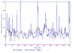
Here you can see the normalized squared atomic displacments of our models:
| model 7
|
model 8
|
model 9
|
model 10
|
model 11
|
 normalized squared atomic displacments of model 7 |
 normalized squared atomic displacments of model 8 |
 normalized squared atomic displacments of model 9 |
 normalized squared atomic displacments of model 10 |
 normalized squared atomic displacments of model 11 |
Here you can see the motion of our analyses.
| model 7
|
model 8
|
model 9
|
model 10
|
model 11
|
 normalized squared atomic displacments of model 7 |
 normalized squared atomic displacments of model 8 |
 normalized squared atomic displacments of model 9 |
 normalized squared atomic displacments of model 10 |
 normalized squared atomic displacments of model 11 |
Discussion
If we look at the squared atomic displacments of our models we can see that almost every model has a peak at the same place.
Here is an overwiew, where are the peaks of the models:
| position of the peak
|
value of the peak
|
| model 7
|
| 250
|
3.0
|
| 290
|
1.5
|
| 300
|
1.5
|
| 310
|
1.5
|
| model 8
|
| 10
|
0.8
|
| 12
|
0.8
|
| 60
|
1.3
|
| 90
|
1.0
|
| 110
|
0.6
|
| 115
|
0.6
|
| 250
|
2.0
|
| 300
|
1.0
|
| model 9
|
| 10
|
0.7
|
| 15
|
0.7
|
| 50
|
0.8
|
| 110
|
1.8
|
| 190
|
0.6
|
| 250
|
0.7
|
| 310
|
1.2
|
| model 10
|
| 250
|
8
|
| model 11
|
| 20
|
0.6
|
| 220
|
0.8
|
| 310
|
0.9
|
| 315
|
0.9
|
| 350-380
|
~1.2
|
| 405
|
1.5
|
El Nemo
General information
Results
Here you can see the CA distance fluctuations for the different modes:
This matrix displays the maximum distance fluctuations between all pairs of CA atoms and between
the two extreme conformations that were computed for this mode (DQMIN/DQMAX). Distance increases are
plotted in blue and decreases in red for the strongest 10% of the residue pair distance changes.
Every pixel corresponds to a single residue. Grey lines are drawn every 10 residues, yellow lines
every  100 residues (counting from the upper left corner).
| model 7
|
model 8
|
model 9
|
model 10
|
model 11
|
 Fluction matrix between the two different modes from model 7 |
 Fluction matrix between the two different modes from model 8 |
 Fluction matrix between the two different modes from model 9 |
 Fluction matrix between the two different modes from model 10 |
 Fluction matrix between the two different modes from model 11 |
El Nemo provides three different animated gif to the user, which show the motions of the protein. Furthermore, we created another animated gif. Therefore, in this case we have four different anmiated gifs. We listed all gifs for one model in on line.
Model 7:
| picture from us
|
picture 1 from ElNemo
|
picture 2 from ElNemo
|
picture 3 from ElNemo
|
 Picture of the motions of Model 7 from El Nemo, which is generated by us |
 Picture 1 of the motions of Model 7 from El Nemo, which is generated by the program |
 Picture 2 of the motions of Model 7 from El Nemo, which is generated by the program |
 Picture 3 of the motions of Model 7 from El Nemo, which is generated by the program |
Model 8:
| picture from us
|
picture 1 from ElNemo
|
picture 2 from ElNemo
|
picture 3 from ElNemo
|
 Picture of the motions of Model 8 from El Nemo, which is generated by us |
 Picture 1 of the motions of Model 8 from El Nemo, which is generated by the program |
 Picture 2 of the motions of Model 8 from El Nemo, which is generated by the program |
 Picture 3 of the motions of Model 8 from El Nemo, which is generated by the program |
Model 9:
| picture from us
|
picture 1 from ElNemo
|
picture 2 from ElNemo
|
picture 3 from ElNemo
|
 Picture of the motions of Model 9 from El Nemo, which is generated by us |
 Picture 1 of the motions of Model 9 from El Nemo, which is generated by the program |
 Picture 2 of the motions of Model 9 from El Nemo, which is generated by the program |
 Picture 3 of the motions of Model 9 from El Nemo, which is generated by the program |
Model 10:
| picture from us
|
picture 1 from ElNemo
|
picture 2 from ElNemo
|
picture 3 from ElNemo
|
 Picture of the motions of Model 10 from El Nemo, which is generated by us |
 Picture 1 of the motions of Model 10 from El Nemo, which is generated by the program |
 Picture 2 of the motions of Model 10 from El Nemo, which is generated by the program |
 Picture 3 of the motions of Model 10 from El Nemo, which is generated by the program |
Model 11:
| picture from us
|
picture 1 from ElNemo
|
picture 2 from ElNemo
|
picture 3 from ElNemo
|
 Picture of the motions of Model 11 from El Nemo, which is generated by us |
 Picture 1 of the motions of Model 11 from El Nemo, which is generated by the program |
 Picture 2 of the motions of Model 11 from El Nemo, which is generated by the program |
 Picture 3 of the motions of Model 11 from El Nemo, which is generated by the program |
Discussion
Anisotropic Network Model web server
General information
Results
Here you can see the B-factor distribution of the real occuring B-factors (black) and the calulated B-factors (blue).
| model 1
|
model 2
|
model 3
|
model 4
|
model 5
|
 Distribution of the B-factors and the calculated B-factors in Model 1 |
 Distribution of the B-factors and the calculated B-factors in Model 2 |
 Distribution of the B-factors and the calculated B-factors in Model 3 |
 Distribution of the B-factors and the calculated B-factors in Model 4 |
 Distribution of the B-factors and the calculated B-factors in Model 5 |
In the next table, the motion of the protein of the different models is shown:
| model 1
|
model 2
|
model 3
|
model 4
|
model 5
|
 Calculated motion of the ANM model 1 |
 Calculated motion of the ANM model 2 |
 Calculated motion of the ANM model 3 |
 Calculated motion of the ANM model 4 |
 Calculated motion of the ANM model 5 |
Discussion
oGNM – Gaussian network model
General information
Results
Discussion
NOMAD-Ref
General information
Results
| model 1
|
model 2
|
model 3
|
model 4
|
model 5
|
 Histogram of the cRMS for model 1 |
 Histogram of the cRMS for model 2 |
 Histogram of the cRMS for model 3 |
 Histogram of the cRMS for model 4 |
 Histogram of the cRMS for model 5 |
| model 1
|
model 2
|
model 3
|
model 4
|
model 5
|
|
|
|
|
|
|
All-atom NMA using Gromacs on the NOMAD-Ref server
General information
Results
600K
Here you can see the motion of 1BPT at temprature 600K.
| model 7
|
model 8
|
model 9
|
 normalized squared atomic displacments of model 7 |
 normalized squared atomic displacments of model 8 |
 normalized squared atomic displacments of model 9 |
2000K
Here you can see the motion of 1BPT at temprature 2000K.
| model 7
|
model 8
|
model 9
|
 normalized squared atomic displacments of model 7 |
 normalized squared atomic displacments of model 8 |
 normalized squared atomic displacments of model 9 |
Comparison to an Elastic Network Calculation
Next, we want to compare the result of All-atom NMA to an elastic network calculation (NOMAD-Ref).
| model 7
|
model 8
|
model 9
|
 normalized squared atomic displacments of model 7 |
 normalized squared atomic displacments of model 8 |
 normalized squared atomic displacments of model 9 |


