Pedigree Chart Visualization
From Protein Prediction 2 Winter Semester 2014
Revision as of 06:15, 19 November 2014 by Ppwikiuser (talk | contribs)
A pedigree chart is a simple and easy to read diagram showing the occurrence and appearance or phenotypes of a particular gene in an organism and its ancestors. Pedigrees use a standardized set of symbols:
- squares: males
- circles: females
- diamonds: the sex of the person is unknown
- filled-in (darker) symbol: someone with the phenotype in question
- shaded or half-filled symbol: heterozygotes
- horizontal and a vertical line: connects parents to their offspring
- ....
Project Ideas
GUI mockups
- User experience
- Functionality & Features
| Appearance | Calculation | Others |
|---|---|---|
| Color Scheme | Auto probability | Tool Tip |
| Shape Selection | Auto connection (while changing affected nodes) |
|
| Vertical/Horizontal Selection | Scaling |
Tip: showing some images (Photoshop, Gimp, Inkscape, ...) makes it easier to follow your ideas
Application design
- Expected technical difficulties
- Fancy libraries you plan to use
Your data
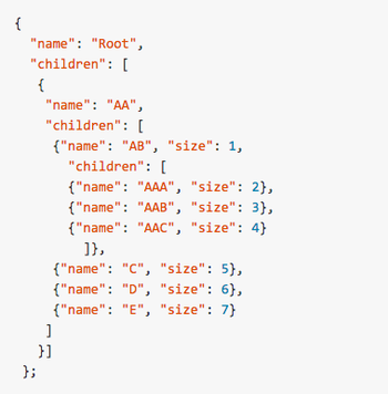
- D3 layouts requires specific data structure for trees
Roadmap
- Week 1
- Week 2
